
A whole while ago I promised a review on this palette, and I’m finally doing it. This is a palette I’ve used in a million ways and for a good couple of months straight. I’ve even used up 7 of the shades, so I know what this palette is all about. But first things first, let’s see what the palette looks like and some swatches, shall we?

The light pink on the left and the tan shade I’ve repressed, that’s why they look a little bit beaten up. I have hit pan on them a long time ago and had to repress them aas they were the transition and crease shade for every look and they became unreachable for my brushes at some point.
Let’s see the swatches. I swatched them by rows, from left to right, first then second row, with one exception. After swatching them I realised I forgot to swatch the shimmery purple and I added it to the end. I do not have the shade names as they came on a plastic sheet that I have long lost by now. I tried to keep them around, but those go missing in the end no matter the effort.


The first shade from the palette is missing because it was a matte cream shade that I’ve used long before this blog was even thought into existance. It was a good cream shade.
The first shade on my arm is a champagney icy-pink. It is very creamy and works well with the warmer shades like the tan or the brown.
The second shade is a matte bright pink that was a joy to apply. It was pigmented, but buildable so I had no issues making it work in my looks. It works amazingly with the shimmery purply shade. I loved it as blush also.
Next is a shimmery brown that applied smoothly and that looks amazing with a tan shade in the crease. It even works as a crease shade if you take the time to blend it.
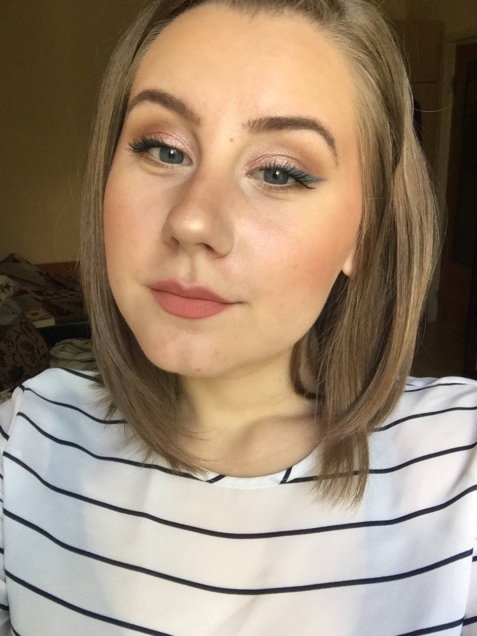
Then we have a shade that doesn’t really speak to me and that I’ve used just as an eyeliner topper. I’m talking about the gunmetal shade. I kept telling that I’ll do a really intense look with it, but I never got around to it, because it really isn’t my style. It is really beautiful as eyeliner though. I’ll add a picture below featuring it.
No palette can be without a dud which in this case is the following shade. In the pan it looks like a beautiful dark purple with purple sparkles all throughout. As you can see swatched it looks like a dark brown with some purple glitter. On the eyes it looks like a muddy brown and that’s about it. I never could make this shadow work for me so I’ve given up on it.
And we’ve reached the second row. The first shade is a baby pink that works great to diffuse the other brighter pink. Was it absolutely necessary for this palette to be cohesive? No, since the other pink could be sheered out as much as necessary, but I used it up no problem.
We’re leaving the purply shimmery shade for last, because I skipped it in the swatchy swatch, so our next shade is the tan. It could easily be my favourite shade in this whole palette. It’s just the perfect transition shade for my skin tone and my taste in eyeshadow. It performed perfectly every single time.
Then we have the two darker browns. As you can see one is warmer and the other is cooler/purply. They performed fine, at times could be a bit patchy and difficult to blend, but over all good shadows.
Don’t even get me started on how much I hated that black. You know how beauty gurus always say tap you brush on the palette before going on the eyes with the shadow? Well, after tapping my brush several times, I noticed black specks all over and then one morning I managed to get a good chunk of this black all over me and my floor. To be scrubbing floors of black eyeshadow at 6 am is no one’s dream and it certainly wasn’t mine. I kept it taped in, I tried everything and after taking these photos I just scraped it into the garbage can. Is it a good black shadow? I have no idea. It swatched well, it was clearly soft since it broke, I just didn’t care for it and the hassle it brought with itself.
Eh, and we’re finally down to that shimmery purple-gold shade that is another favourite in this palette. It did wonderful things to accentuate my blue eyes. It was creamy, pigmented and had a really nice effect. One thing to be noted, though, is that this shade along with the champagne one, towards the end got a bit crumbly and difficult to use (which could also be attributed to the fact that I have had this palette for 5 years and it’s long past it’s shelf life). Before using this shade up, I mixed it with the champagne one and used them as highlighter. They work fine for that too.

This look is made up of the tan in the transition, the warmer brown in the crease and outer corner, the champagne on the lid and the gunmetal as eyeliner (on top of a blue eyeliner).
The next look has the tan and the two pink shades in the transition and the shimmery purple all over the lid. This was my favourite look.

Lastly, this look features the tan and brown shades in the crease and transition and the shimmery brown all over the lid and blended into the crease.


This is a good palette overall. There are the two duds that you now know of, but otherwise if this colour scheme speaks to you, you’ll be extremely satisfied with this palette. It is very appropriate for work makeup and easy to work with.
I hope you enjoyed this post and found it helpful! Kisses! ❤

